MedTech Concept · Ophthalmology · Safety-First IA
Aegis Clinician: A Cockpit for Identity, Evidence, and AI Accountability
An ophthalmology dashboard dropped patient identity on scroll. It showed results with no acknowledgement gate. It let AI notes auto-sign before anyone read them. Aegis is a one-week self-directed concept that designs those risks out at the IA level.
Self-directed concept · 1-week sprint · No live measurement. Outcomes below describe design intent, not measured production results.
- Domain
- MedTech · Ophthalmology · Clinical Safety & Compliance
- Deliverables
- Safety-first cockpit blueprint · Action↔Data IA patterns · Risk × UX specification
- Scope
- Risk research · IA · Workflow design · Hi-fi prototyping · Narrative
- Timeline
- V1 audit → V2 concept · 1-week self-directed sprint · No live measurement
Problem framing
From passive reports to a safety-critical cockpit
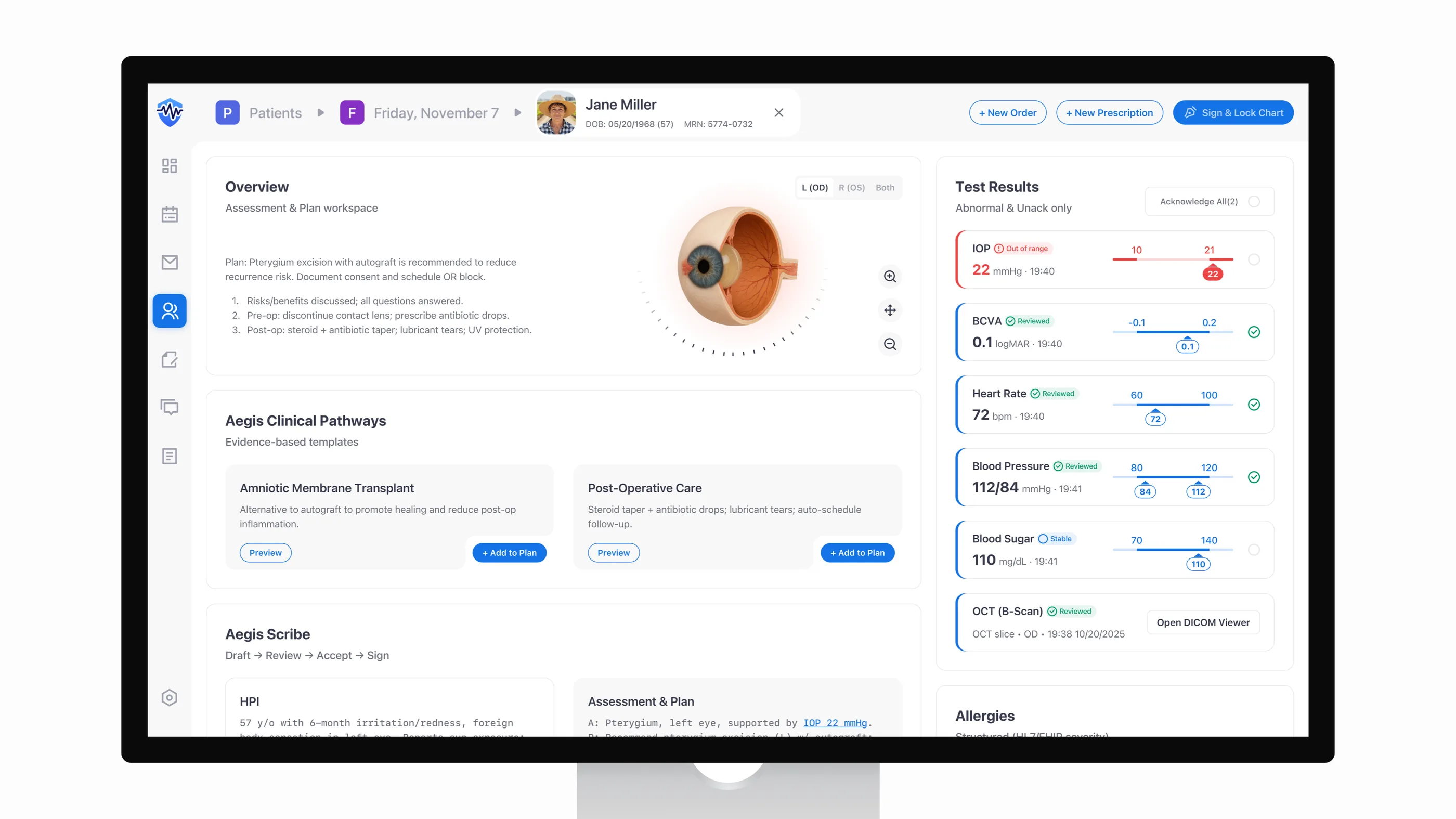
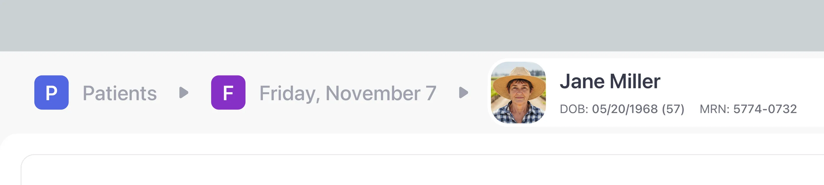
When I audited V1, the dashboard read like a printed report. AI notes and lab values shared one page, but the states were ambiguous. Contrast gaps slowed routine decisions. Cognitive load ran higher than the work called for. Identity scrolled off the screen, allergies were free text, and results defaulted to a passive “Verify.” Those gaps put retina and nursing teams at risk right when the patient's context matters.
I ran a hazard review against ISO 14971 and IEC 62366 and pulled two risks worth designing out at the IA level: wrong-patient exposure and cognitive overload. Patching either one with banners and warnings after the fact would leave the underlying structure intact. So V2 rebuilds the structure instead.
Audience
Serve clinicians, nurses, and compliance
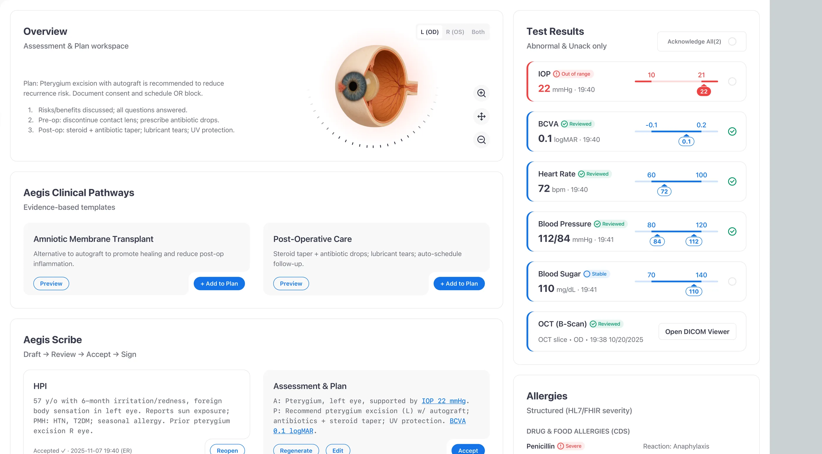
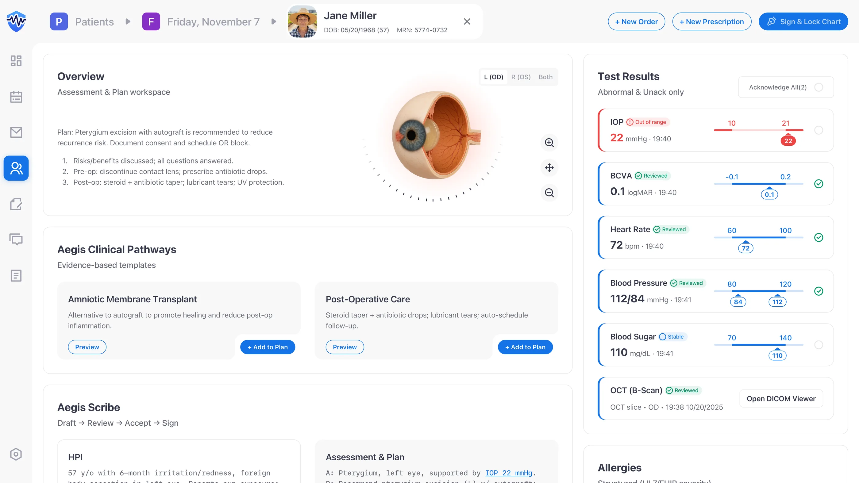
V2 rests on five pieces I picked on purpose: a persistent identity banner, a two-column Action↔Data IA, structured allergies, a closed-loop results queue, and an accountable AI Scribe. Each one maps to a specific reader: it keeps clinicians in flow, gives nurses a clean task list, and leaves compliance an auditable trail.
- Clinicians: I kept the patient banner, allergies, and key orders in view before any therapeutic step. Pairing Action↔Data is how I cut working-memory load. Evidence sits next to the action, not behind a tab.
- Nurses & techs: structured results queues and explicit states (“New,” “Critical,” “Acknowledged”) give handoffs a shared mental model. I wrote the state vocabulary as operable verbs, not adjectives, so a row reads like a task rather than a status.
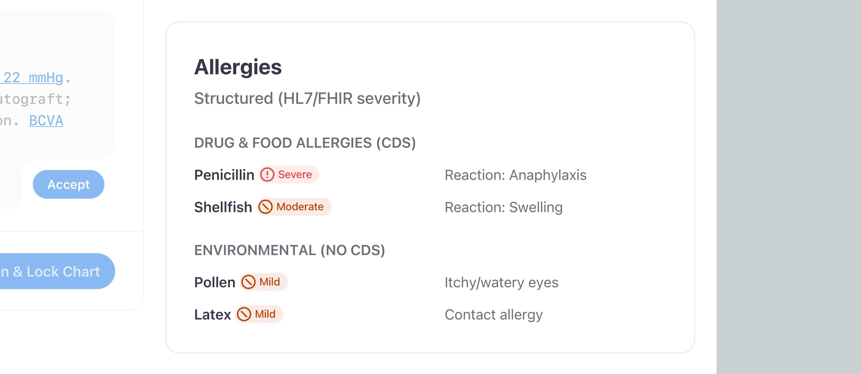
- Compliance: closed-loop acknowledgements, HL7 FHIR-coded allergies, and AI review gates produce the audit trail Privacy and Safety Officers actually demand. I built the trail as a feature, not a side artifact.
Anchor signals
Anchor safety signals before any action
The images below trace the safety chain I designed end to end: identity locked in place, Action↔Data paired so evidence travels with action, and allergies coded against HL7 FHIR and SNOMED CT.
Closed-loop safety
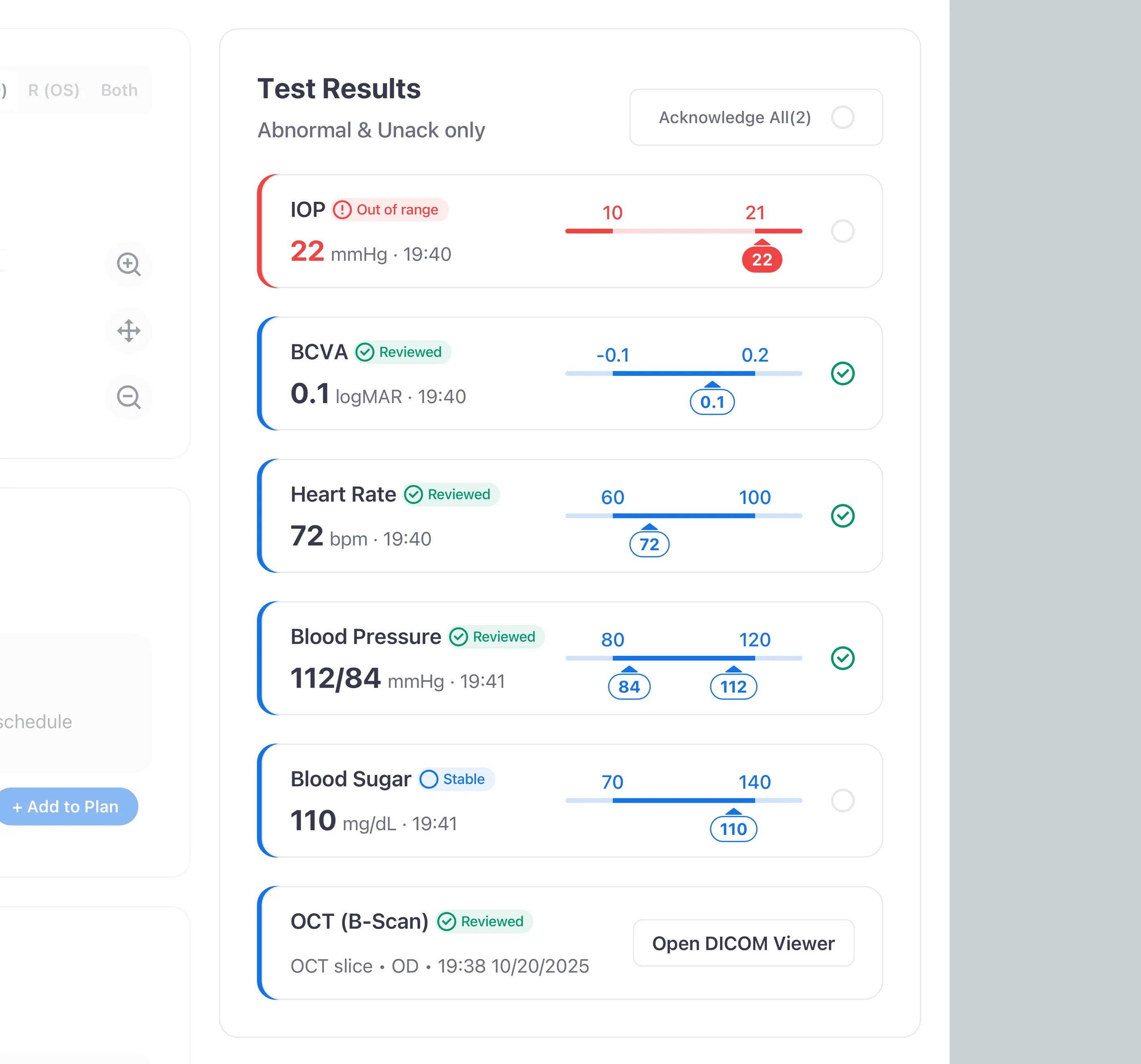
Treat test results like a task queue
I treated test results as a task queue, not a list. Each abnormal value becomes a row with explicit states (New / Unack and Critical) and an audited acknowledgement gate. No abnormal value clears without a human sign-off, and every acknowledgement shows up in the record, which turns the gap between “saw it” and “owned it” into something the audit trail can tell apart.
At-a-glance viz
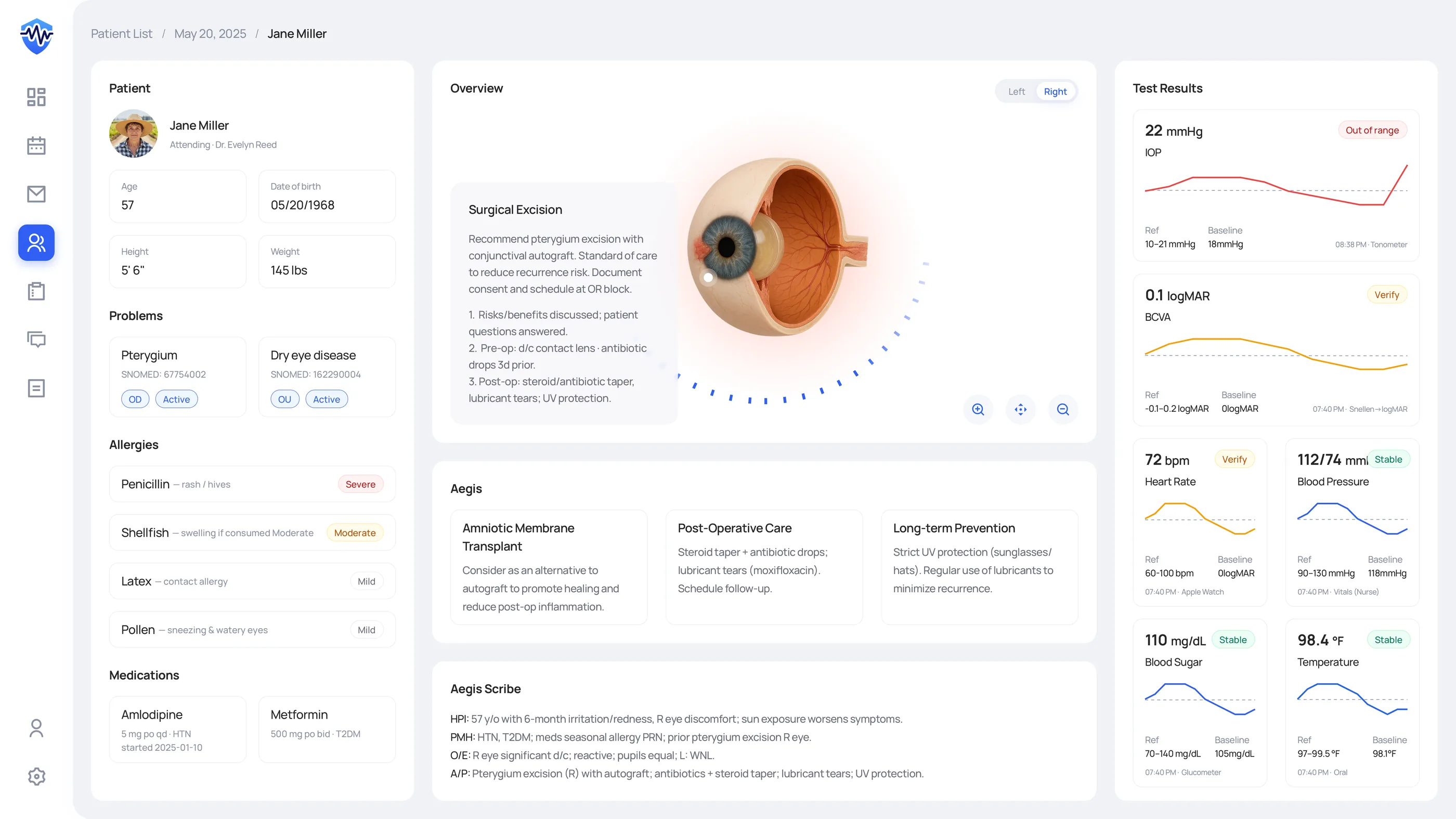
Lead with high-contrast, readable trends
I led with the value, not the chart. High-contrast lines meet WCAG 1.4.11, the numeric value sits at the top of the hierarchy, and shaded reference bands let a clinician check a trend at a glance instead of holding ranges in working memory. A chart on a clinical screen is decision support, not decoration. If a clinician has to work to read it, it has failed.
AI workbench
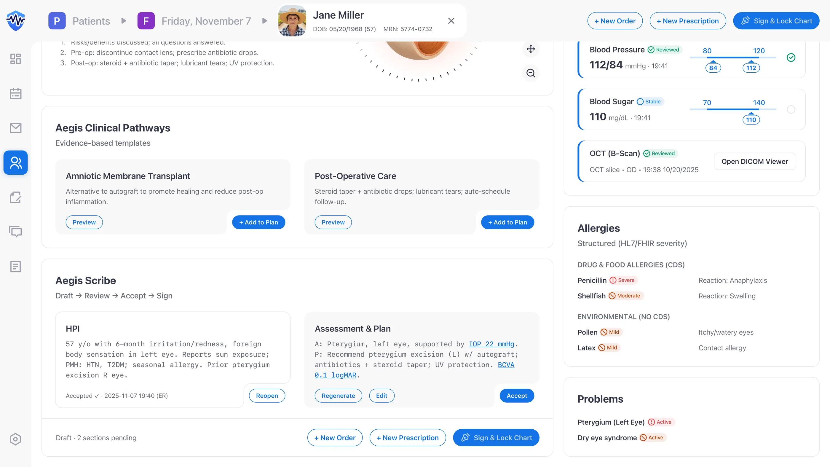
Enforce Draft → Review → Accept → Sign
I enforced Draft → Review → Accept → Sign as four explicit states, not labels on a single button. “Sign & Lock” stays disabled until every AI block has been accepted or edited, and CPOE stays in the same flow so teams never leave the cockpit to enter an order. It's the same Draft → Review → Accept gate I first worked through on Mika, the AI agent inside Kubit’s Logica analytics platform. The trust problem with AI output looks the same across domains: users need a way to check the work before they own it, and the gate is what gives them that.
V1 audit → V2 concept
Audit, reframe, prototype, validate
One sprint to audit V1, architect the cockpit, and validate against WCAG 2.1 AA, HL7 FHIR, and workflow edge cases. The four-step rhythm:
- Discovery: contextual inquiry surfaced wrong-patient risk, alert fatigue, and missed-results hazards.
- Information architecture: paired Action↔Data to match how clinicians think, remapped nav to “Work vs Evidence,” and rewrote status labels into operable verbs.
- Prototype: a hi-fi cockpit pulled sticky identity, structured allergies, and task-style results into one viewport for fast validation.
- Evaluation: formative checks on WCAG 2.1 AA contrast, HL7 FHIR compatibility, and AI audit requirements before I packaged the narrative.
Design intent
What this concept is engineered to do (not what it has measured)
- Designed to expose near-misses. The persistent identity banner puts patient identity in view before any therapeutic step. Designed to reduce wrong-patient starts; not measured in production.
- Designed for 100% acknowledgement closure. Every result is an explicit task. None of them dismiss without acknowledgement and signature. Designed to enforce 100% acknowledgement; not measured in production.
- Estimated 52% reduction in working-memory load. Action↔Data pairing is built to lower working-memory load. The 52% figure is a heuristic estimate from a cognitive-load checklist applied to V1 vs V2 wireframes, not a clinical study.
- WCAG 2.1 AA compliant in design. Icon+text redundancy, high-contrast charts, and structured allergies meet AA in the wireframes. You can see it in the wireframes; production validation would take a clinical pilot.
Reflection
What this would need to graduate from concept to production
The honest answer: a clinical pilot. The cognitive-load claim needs a paired study (V1 vs V2 task-completion under time pressure), not a checklist. The AI Scribe accountability claim needs an audit-trail review across a real chart corpus. The closed-loop results queue needs longitudinal data on missed acknowledgements before and after the cockpit ships.
The IEC 62366 usability engineering work would need to be formalized: task analysis, hazard register, and summative evaluation with retina specialists and nursing leads. None of that fits the scope of a one-week concept. What the concept does deliver is the IA pattern set, plus the discipline of stating the methodology gap above the fold rather than inflating concept claims into measurement language.
What I carry forward
Treat human-in-the-loop as a contract with your users, not a design pattern. Every AI feature he designs now starts with one question: what does a person need to see before they can responsibly act on it?