AI Prototyping · iOS Concept
Hooray: A To-Do App That Judges You
A to-do app that moves through eight faces as you work and never once says well done. I built the first version in a week to see how far four AI tools could carry a concept. The part worth writing down came a month later, when I had to stop them.
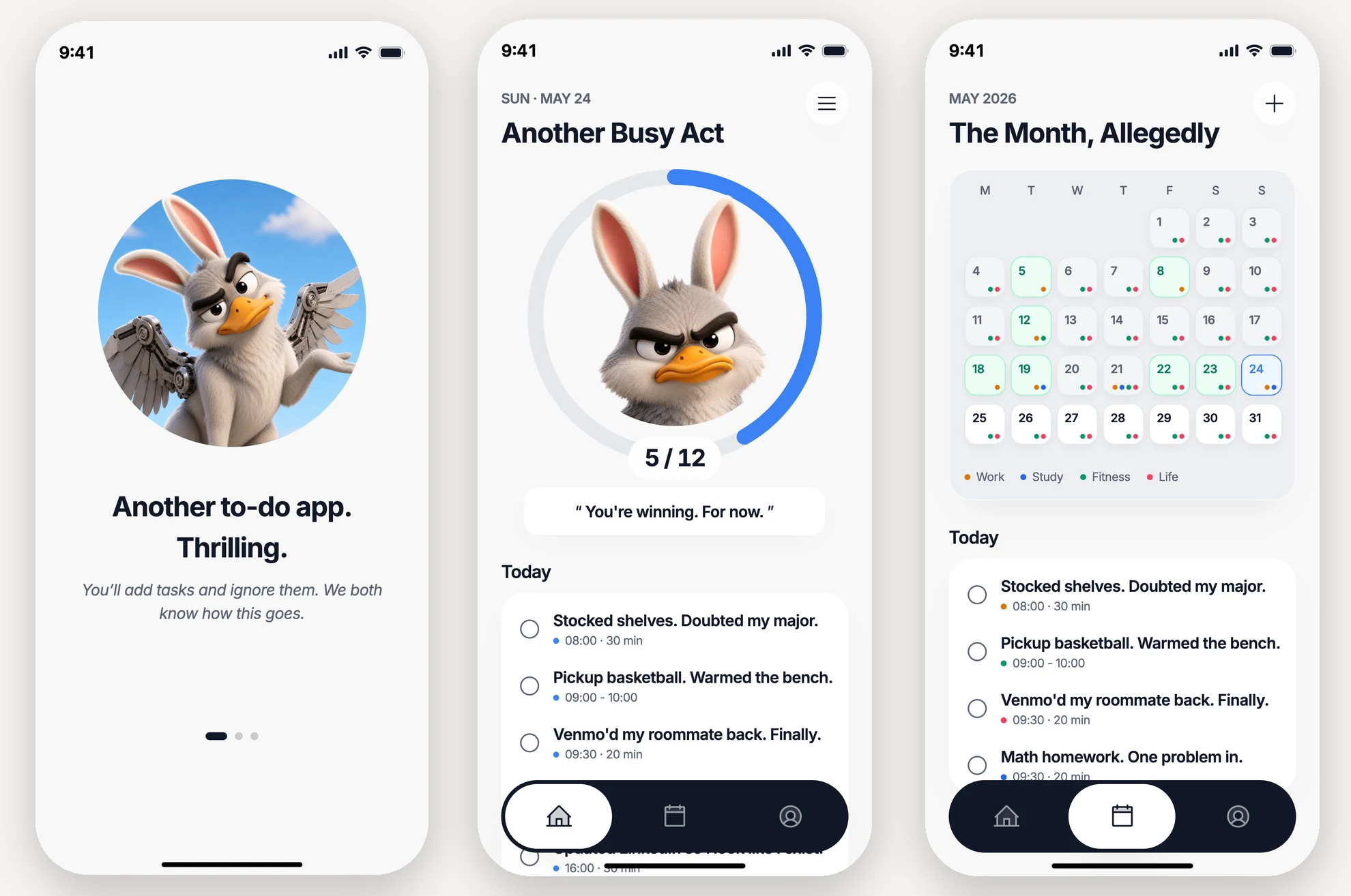
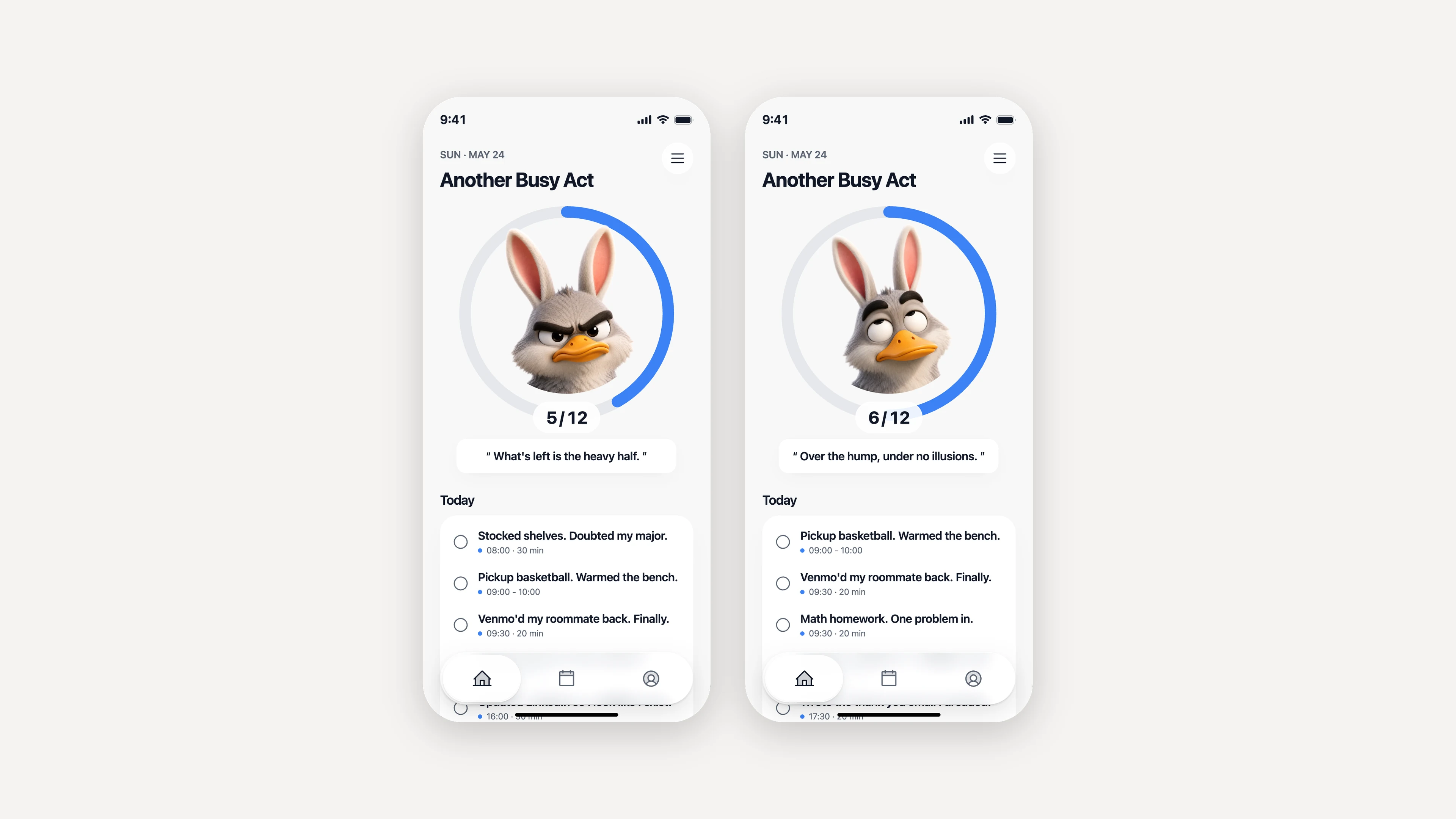
Complete a task to see the count, progress ring, mascot, and response copy update together
- Domain
- Consumer Productivity · Behavioral Concept · iOS
- Deliverables
- Interactive Prototype · 10-Screen iOS Flow · 8-Expression Mascot System · Progress-Aware Copy System
- Scope
- Product Concept · Interaction Model · Mascot & Voice System · AI-Assisted Prototyping · Pixel QA
Why this exists
What if praise is too easy to ignore?
Most to-do apps cheer you on, then go quiet the moment you skip half the list. Hooray is gloomy and it makes fun of you. Building something mean on purpose was the most fun I’ve had on a project.
The mascot looks like it’s egging on your worst habits. It’s really pushing you off them. Nobody glued to their phone turns disciplined overnight. The app just has to be funnier than your excuses for not starting.
The character
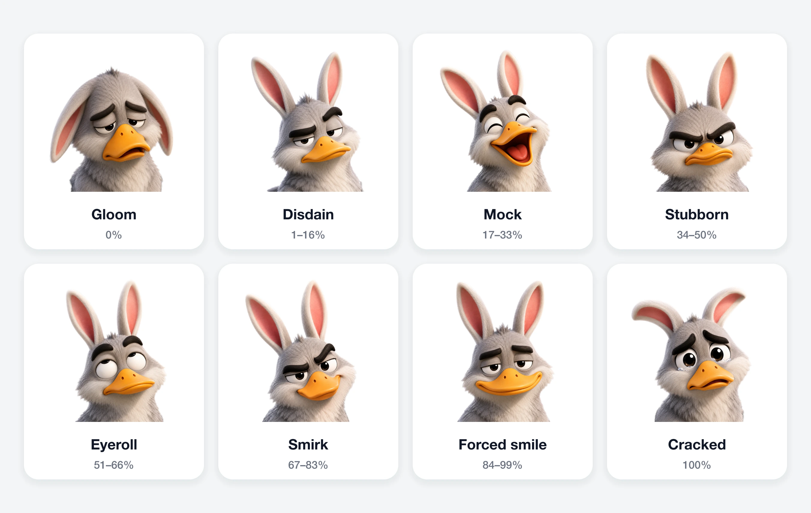
Eight expressions that match your progress
The mascot has eight faces. You don’t pick which one shows up. Your progress does. Each face is a fixed asset: same character, different expression, tied to a completion range. The more you finish, the further it moves along: gloom → disdain → mock → stubborn → eyeroll → smirk → forced-smile → cracked. Do nothing and you get gloom. Finish everything and you don’t get a happy grin. You get a face that’s cracked from the effort.
One rule kept it working: the mascot is a fixed image. It never gets recolored or restyled.
The voice does the work
How the sass actually works
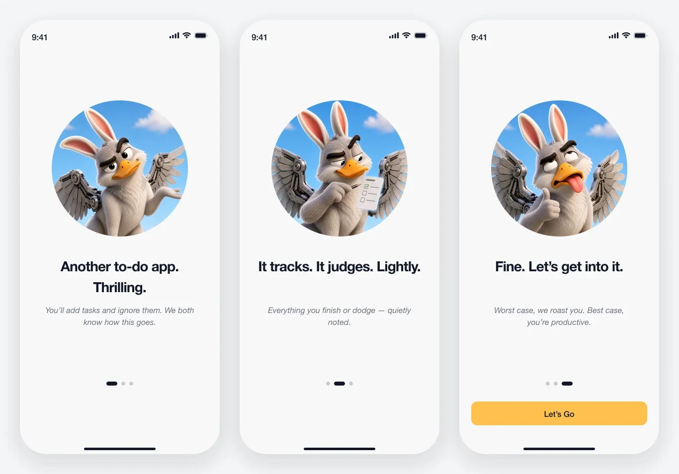
The jokes are sorted into groups by how much you’ve finished. Check off a task and the app pulls a fresh line from the group that matches your new progress. “Progress. Technically.” There’s no backend and no AI reading your mood. Just a percentage and a stack of pre-written lines. Cheerful apps say the same thing whether you did one task or ten, so people stop noticing. These jokes change with your progress, so people keep reading.
Tone guardrails for a shippable version. The rules the copy is written against:
- Judge the task, never the person. No lines about intelligence, appearance, identity, or mental health.
- The user should hold the dial. A shippable version would let people reduce or disable the sarcasm.
- Notifications would stay softer than in-app copy. The lock screen is no place for attitude.
- Failure never escalates. Miss a week and the mascot stays dry. It does not get meaner.
- Every line is written and reviewed by a human. Nothing is generated at runtime.
The decisions
Four decisions the tools could not make
The real skill is knowing which design calls to protect.
Decision. Eight fixed mascot images. The agent never recolors or restyles them at runtime. Why. Consistency is the character. Fixed assets load instantly and every face can be QA’d. Why not runtime generation? An agent will happily repaint the character to match a color theme. That is drift, not expression. Trade-off. A hard ceiling on expressiveness: eight faces, no more.
Decision. Copy is rule-based. A completion percentage picks a line from a pre-written group. No runtime LLM call. Why. The tone stays under control, responses are instant, there’s no backend, and every state can be tested. Why not a live model? Improvised sass sounds fresh until it slips: latency, a backend, and a tone I cannot fully test. Trade-off. Limited variety. Live in the app long enough and the lines repeat.
Decision. Progress maps to eight discrete states. Why. A state change you can feel beats a gradient you can’t. Eight states keep the asset count sane. Why not continuous blending? Nobody notices a gradient move. Trade-off. Granularity: 55% and 60% can land on the same face.
Decision. Override the Figma source on the tab bar. Replace the opaque dark bar with a floating glass one, rebuild the shell on iOS conventions, and leave the product behavior untouched. Why. The bar carried too much visual weight and flattened the content hierarchy. Why not keep the fidelity? Staying faithful to a file that is wrong only ships the mistake intact. Trade-off. This one broke the rule the whole pipeline runs on. Reading every value off the source is what keeps an agent from guessing, and it is also what carried my own mistake straight into the build.
The build
From concept to coded prototype in one week
Tooling. ChatGPT Image 2 (mascot faces) · Claude (design guideline) · Codex (Figma build) · Claude Code (prototype) · Figma Dev Mode MCP (bridge).
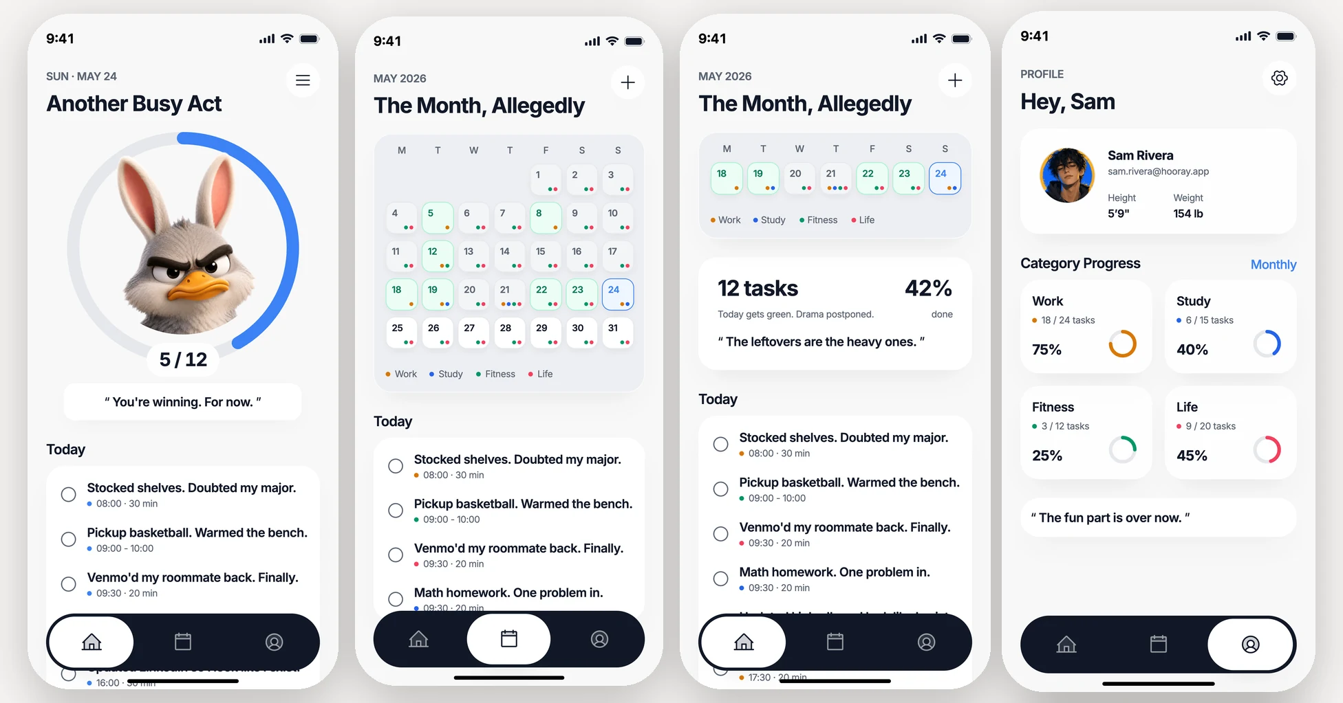
Hooray started with my app concept and a design brief. ChatGPT Image 2 produced the mascot faces from it. From there, Claude wrote the design guideline: colors, typography, components, copy rules, and the mascot-to-progress mapping. That guideline directed Codex to build the full Figma file of 10 screens, components, and variants. Then Claude Code took those Figma frames and built the tap-through prototype, reading every value straight from the file instead of guessing. Four tools, one bridge, four stages, about a week.
The first coded pass matched the Figma file exactly, including its opaque dark tab bar, which was the pipeline doing its job. The file was wrong, and four tools had faithfully shipped it. A month later the second pass replaced the bar, rebuilt the shell on safe areas and concentric corner radii, and left the product behavior alone.
Reflection
What changed in my workflow
What lasted beyond the prototype was the workflow I developed around these agents.
- Read values, don’t guess them. Give an AI one source of truth and a rule against guessing, and its front-end work goes from close-enough to matching the file. Every output stayed a draft until it survived a check against that source.
- Rules made the character durable. Once the faces and jokes were written down as explicit rules, an AI tool could build the character without breaking it.
Hooray is still a prototype. It’s not on the App Store yet, but it’s the one I’d most want to take further. Maybe the same people who ignore motivational apps will actually use one that makes fun of them.
What I would test next
If this ships, two questions get tested before anything else. Retention: does a judgmental voice still move people once the novelty wears off? Safety: at what point does playful tip into demotivating, and for whom?